

English
A development project — bicycle path, greenway, requalification of public space, development of a natural site — is not justified solely by political intention or a territorial vision. To convince funders, elected officials, educational services and citizens, a solid attendance record is needed: a document that describes the reality of current uses, that projects future uses after development and that lays the foundations for an impact assessment. But an attendance report is only reliable if it is based on a rigorous methodology. Poorly collected data, unrepresentative measurement periods or a confusing presentation of results can weaken a case that is, in essence, relevant. This article explains step by step how to build an attendance report that withstands the examination of instructors and that is a sustainable management tool for the community.

An attendance report is not a simple summary of figures. It is a decision support document that must answer specific questions depending on the stage of the project.
In the diagnostic phase (before development), the assessment must answer: how many users already frequent this axis or this space? What are the dominant profiles (pedestrians, cyclists, families, athletes)? What are the peaks of use and the off-peak periods? Are there unexplained saturation points or under-uses? These elements are used to size the project, to identify priority needs and to formulate hypotheses for evolution after development.
In the justification phase (financing file), the balance sheet must demonstrate that the project meets a proven, measurable and growing need. He must convince an instructor who does not have knowledge of the field that the investment requested is proportionate to the real and expected use.
In the evaluation phase (after completion), the balance sheet should make it possible to compare the situation before and after development, to measure the impact produced and to justify the use of the public funds committed.
An assessment that does not clearly answer these questions — because there is a lack of data, because the measurement periods are too short or because the presentation is confusing — weakens the file even if the project is well designed. Methodological rigor is not a bureaucratic requirement: it is what gives the document its strength of conviction.
Before collecting data, it is essential to define precisely what you want to measure and why.
Identify the geographic perimeter. Does the assessment relate to a single axis, to a network of roads, to a delimited site or to a set of access points? Too broad a perimeter produces averaged data that masks disparities. A perimeter that is too narrow does not reflect the entire travel system concerned by the project.
Define the mobilities to be measured. Is it just a question of counting cyclists? Pedestrians? Both? In some contexts, distinguishing walkers from utility users (home-to-work trips) is important in order to calibrate the project. It must be ensured that the counting technology selected is capable of producing the necessary distinctions.
Set the time horizon for the balance sheet. A balance sheet built over three weeks of measurement in the middle of summer is not representative of annual use. A balance sheet built on twelve months of continuous data is. Between these two extremes, the minimum recommended duration for a reliable assessment is three months, ideally covering contrasting periods of attendance (high season and low season, or school season and vacation).
Anticipate the use that will be made of the data. If the report is intended for an AVELO or CRTE file, the metrics expected by these programs should guide the collection. If the report is intended as an information report for elected officials, the presentation will be different. Defining the target audience for the balance sheet before collecting the data avoids ending up with numbers that do not answer the questions asked.
The representativeness of an assessment depends directly on the choice of measurement points and the duration of observation. These two parameters are often underestimated.
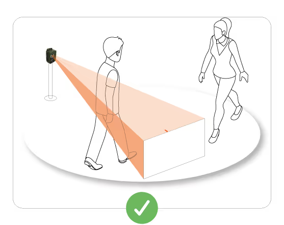
Choose mandatory crossing points. The sensors must be placed at the points where almost all users of the perimeter in question necessarily pass. A bridge, a tunnel, a delimited site entrance, a section without possible bypass are mandatory crossing points that guarantee an exhaustive measure. A sensor placed on an optional section (which some users use and others do not) produces a partial measurement.
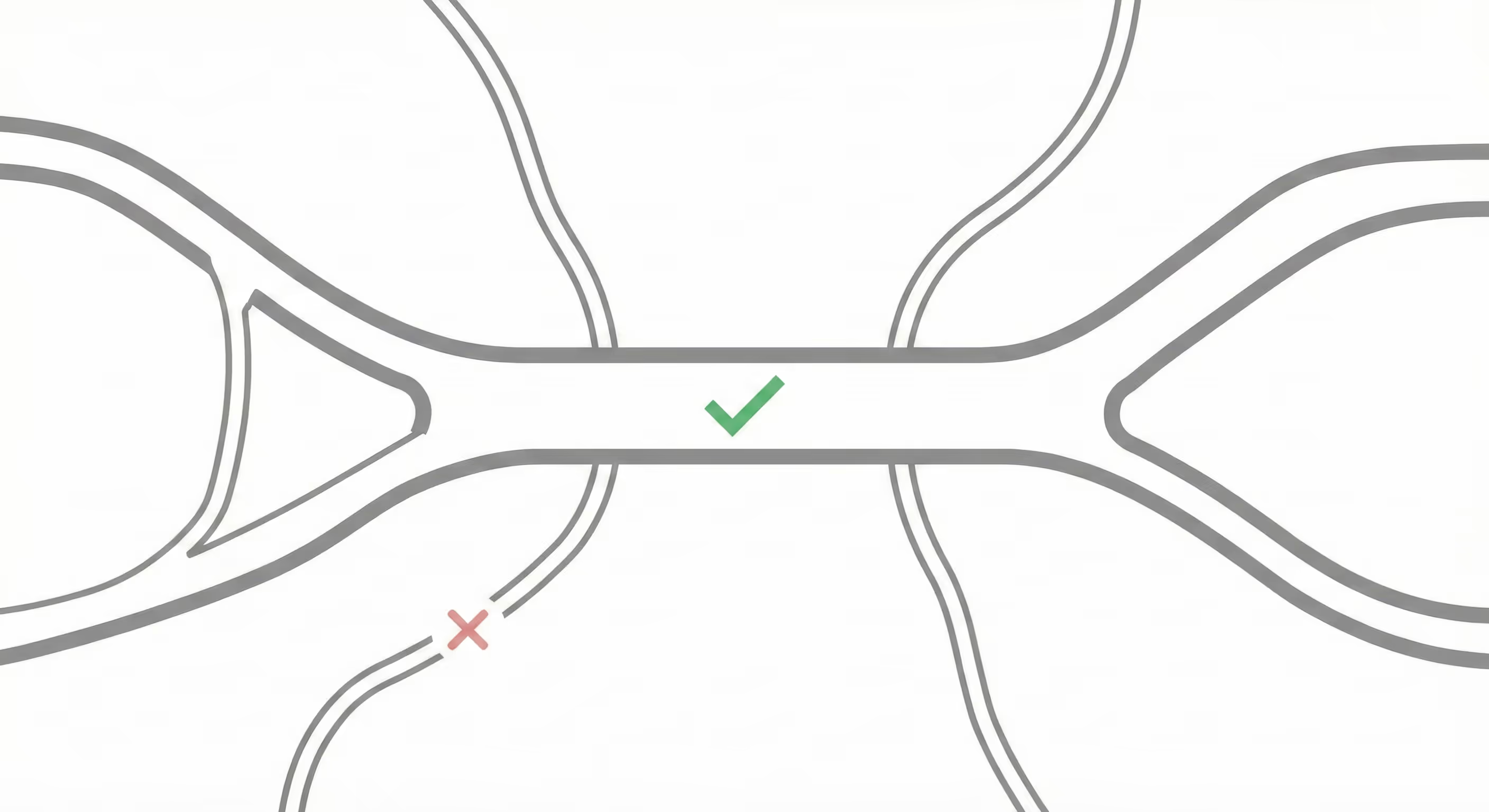
Multiply the measurement points if the network is complex. On a network with several entrances, several sections and several intersections, a single sensor cannot account for overall traffic. It is necessary to deploy several sensors at strategic points and to cross-reference data to obtain a coherent overview.
Calibrate the duration of observation to the seasonal profile of the site. A mountain trail or a tourist greenway have a very marked seasonality. A measurement carried out only in July—August will overestimate annual attendance. On the other hand, a measurement carried out only in January—February will underestimate it. For sites with high seasonality, it is essential to cover at least one high season and one low season, then extrapolate annual attendance by applying documented seasonal coefficients.
Document incidents that affect measurement. A sensor that breaks down for three weeks, a temporary closure of the site or work on a competing axis must be noted in the balance sheet. These events create biases that can skew interpretation if they are not explicitly reported.
Data quality is not enough if the presentation is confusing or difficult to read. An attendance report intended to convince decision-makers or instructors must be clear, visual and structured around the main conclusions.
Start with the key figures. Decision makers often read documents diagonally. Placing the three or four most important figures at the top of the balance sheet (average attendance per day, evolution over the period, dominant user profile) makes it possible to capture attention immediately. The rest of the document expands on these figures and contextualizes them.
Use graphs that are adapted to the data. A weekly evolution curve shows a trend better than a table of raw numbers. A monthly histogram illustrates seasonality better than a list of averages. A pedestrian/cyclist breakdown pie is more legible than a sentence describing the percentages. Charts should be captioned clearly, with named axes and units shown.
Contextualize the numbers. A raw number means nothing without a reference. Saying “250 cyclists per day” is not enough. Saying “250 cyclists per day, an increase of 18% compared to the previous year, and an increase of 35% compared to the average of comparable greenways in the regions” is convincing. Looking for comparative elements — national data, regional benchmarks, data from similar axes — makes it possible to highlight the figures.
Separate measurement data and interpretations. A rigorous balance sheet clearly distinguishes what is measured (objective data) from what is interpreted or projected (assumptions and estimates). This transparency reinforces the credibility of the document.
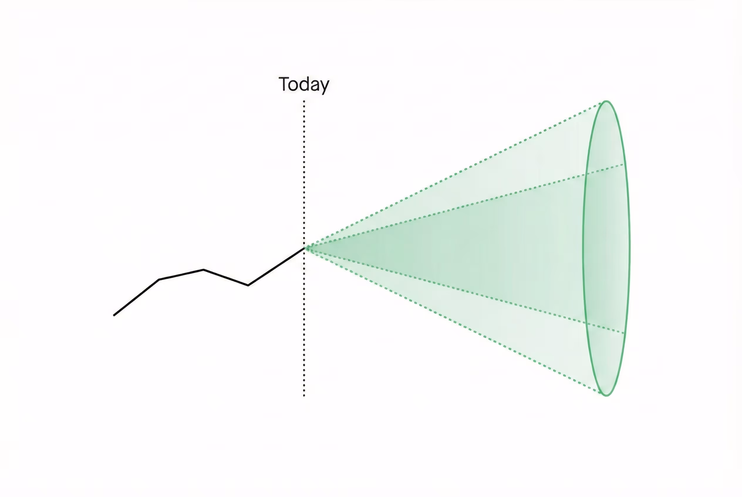
An attendance report intended to justify a development project cannot be limited to describing the current situation. It must also project the evolution of attendance after the project has been completed.
Formulate explicit hypotheses. The projection of use after development is necessarily based on hypotheses: expected rate of modal shift, increase in occupancy linked to improved comfort or safety, attraction of new users. These hypotheses must be formulated explicitly, with the sources or reasoning behind them. An undocumented hypothesis is a fuzzy estimate; a hypothesis supported by comparable data is a solid argument.
Rely on similar projects. While other communities have made comparable developments and documented the evolution of their attendance, these data are valuable references. An increase in ridership of 60% after the development of a separate bike path, observed on several similar projects, is a much stronger argument than a projection that came out of nowhere.
Distinguish between cyclical and structural increases. The first weeks or months after the opening of a development are often marked by an effect of curiosity or media coverage that generates artificial attendance. The projection should focus on structural attendance in the medium term (12 to 24 months after opening), not on the inauguration peak.
Suggest a range rather than a single number. An attendance projection is still uncertain. Presenting a range (between 280 and 340 cyclists per day depending on the hypotheses used) is more honest and more robust than a single figure that may seem artificial or too precise.
Certain recurring errors undermine otherwise well-constructed balance sheets. Identifying them makes it possible to avoid them.
Non-representative measurement period. A report built on summer data only, or carried out during an atypical period (work on a competing axis, exceptional event), does not reflect ordinary use. If the measurement period is constrained, documenting it explicitly and applying seasonal corrections is essential.
Poorly-positioned measurement point. A sensor placed after a turnaround area, at an uncontrolled intersection, or on an optional section produces biased data. Checking that the measurement point is representative before starting the collection is a prerequisite.
Lack of contextualization. Raw numbers without reference or comparison have no convincing power. Any number should be put into perspective.
Confusion between passages and unique users. A report that presents “passages” (each crossing counted) without specifying that some users go back and forth can be misleading. Clarifying what exactly the device measures is essential.
Projections not supported. An impact projection based on a 100% increase without any comparative reference will be immediately contested by an experienced instructor. Undocumented optimistic projections damage the credibility of the entire case.
To facilitate the construction of a rigorous balance sheet, here is a typical structure that can be directly used:
Summary page
Section 1: Methodology
Section 2: Measurement Results
Section 3: Analysis and contextualization
Section 4: Impact Projection
Section 5: Post-development assessment system
This structure ensures that all questions expected by instructors and decision makers are answered, in a logical order that makes it easy to read and make decisions.
If you are preparing a development file and want to set up a system for measuring attendance that will produce the data necessary for a solid balance sheet, Kiomda can assist you from the definition of measurement points to the production of metrics for your file.


.svg)