“This square is always crowded.” “Nobody uses this bike path.” “The park is saturated on weekends.” These statements are regularly heard in consultation meetings, municipal councils and public debates. They seem obvious to those who formulate them, based on daily observation and personal experience. However, when confronted with objective data, they often turn out to be false — sometimes dramatically. Our perception of the use of public spaces is systematically biased by well-identified cognitive mechanisms. Understanding these biases is not an academic exercise: it is a condition for avoiding costly diagnostic errors in the design and management of public spaces.
Our brains are not designed to estimate flows accurately. It works through cognitive shortcuts — heuristics — that are useful in daily life but produce systematic distortions when it comes to evaluating quantitative phenomena.
Availability bias is the tendency to overestimate the frequency of events that are easily remembered. The moments of high traffic mark our memory: the crowded park on a sunny Sunday in June, the saturated bike path on a morning of transport strike, the square invaded during an exceptional event.
These moments remain in our memory because they are salient : they are out of the ordinary, create inconveniences (waiting, noise, congestion) or generate emotions. Conversely, normal days — those when the park is moderately busy, when the bike path is used without saturation, when the square is quiet — leave no memory trace.
Result: when asked about the frequentation of a space, our brain will search its memory for available examples. And what's available are the spikes. We then generalize from a few exceptional days, forgetting the other 300 days of the year.
Concrete example : an elected official considers that a greenway is “very busy” because he has crossed it three Sundays in a row and saw a lot of people. The counting data reveals that the average annual attendance is modest (150 passes/day), but that it actually reaches 600 visits on fine summer Sundays — that is, 15 days a year. The elected official generalized from 4% of the days.
Confirmation bias is the tendency to seek, interpret, and remember information that confirms our pre-existing beliefs, while ignoring or minimizing information that contradicts them.
If a local resident thinks that a square is “overrun by tourists”, he will notice every group of visitors with suitcases, every tourist bus that stops, every person who takes a photo. He won't notice the dozens of local passers-by who pass through the square on a daily basis, because they don't fit into the “tourist invasion” mental pattern.
The result: two people can observe the same space and draw opposite conclusions, each confirming their initial belief. One will see “a lot of tourists”, the other “mostly locals”. Both will be right about part of the reality and wrong about the whole.
Concrete example : a shopkeeper complains that “no one is coming” to his neighborhood since pedestrianization. Counts show that foot traffic has increased by 20%. But the merchant focuses on the absence of cars parked in front of his store (visible, prominent) and does not count the number of pedestrians who pass by (numerous but not remarkable one by one). His brain seeks and finds confirmation of his initial belief.
Our brains tend to generalize from samples that are too small. Observing a situation once or twice is enough to create a general impression, even if these observations are not representative.
The result: we extrapolate from our own experience — necessarily limited to a few passages, to certain hours, certain days — without realizing that it only captures a fraction of reality.
Concrete example : a municipal agent goes by a trail every morning at 8:30am as part of his tour. He never meets anyone and concludes that the trail is underused. The counting data shows that attendance is concentrated between 5 p.m. and 7 p.m. (sports use after work) and on weekends all day long. The agent observes 5% of the total flow and generalizes.
How a question is asked radically influences the answer. “Do you think this park is frequented? and “Does this park seem overloaded to you?” ” require the same judgment, but the word “overloaded” leads to a negative response.
Result: public consultations, surveys or consultation meetings produce different results depending on how the questions are formulated. This bias is sometimes exploited unintentionally, sometimes consciously to obtain the desired response.
Case in point: a survey asks, “Do you think there are too many cyclists on this route? ” → 60% say yes. The same survey was reformulated: “Is the cohabitation between pedestrians and cyclists going well? ” → 65% say yes. The wording changes the answer without the reality changing.
Beyond cognitive biases, visual flow estimation is structurally inaccurate. Studies in cognitive psychology have shown that estimation errors vary according to density and context.
When passages are rare and spaced out, our brains tend to underestimate them. A pass every 5 minutes (12 passes/hour, i.e. 150 passages between 8 am and 8 pm) gives the impression of a “deserted” place. However, 150 daily passages on a mountain trail represent significant attendance.
Typical error factor : x0.3 to x0.6 (we estimate 50 passages while there are 150).
Conversely, when flows become dense and continuous, our brains are saturated and overrated. A square crossed by 500 people in one hour (8 passages per minute) gives the impression of a “crowd” or a “massive flow”, while in relation to the available area, the density can remain comfortable.
Typical error factor : x1.5 to x3 (we estimate 1,500 passages while there are 500).
A flow of 100 people/hour on a narrow street (3 meters wide) seems dense. The same flow of 100 people/hour on a 30-meter-wide esplanade seems sparse. However, the figure is the same. Perception depends as much on spatial density as on absolute volume.
Practical consequence: Visually comparing the use of two spaces with different configurations leads to systematic errors. Managers regularly underestimate the use of large and open spaces, while overestimating the use of narrow and canalized spaces.
Declarative data — surveys, questionnaires, logbooks — are a valuable source of information for understanding motivations and practices. But they cannot be used as a reliable basis for quantifying attendance.
Respondents tend to overestimate socially valued behaviors and underestimate stigmatized behaviors. In a survey on mobility practices, respondents often say they ride more bikes than they actually do (cycling is valued as ecological, sporty, virtuous) and less cars (cars are increasingly stigmatized).
Result: declarative surveys produce modal shares of cycling that are systematically overestimated by 20 to 40% compared to real counts.
Concrete example: a mobility survey in a medium-sized city indicates that 15% of trips between home and work are made by bike. Counts on the main cycle routes reveal a flow compatible with 8-10% of the real modal share. The discrepancy is explained by over-reporting (“I ride a bike” = “I ride a bike sometimes, when the weather is nice”) and by the desire bias.
When someone is asked, “How many times did you go to the park this month?” ”, he doesn't count — he's rebuilding. And this reconstruction is biased by the same mechanisms as those described above: he remembers significant moments (good weather, particular event) and forgets the trivial passages.
Result: the declared frequencies are almost always false, with variations of ± 50% depending on the profiles.
Traffic surveys mainly capture regular, available and cooperative users. Users who are casual, in a hurry, or are reluctant to respond are under-represented. However, the latter can represent a significant part of real attendance.
Practical consequence: A survey conducted only with visible users (those who can easily be interviewed) will give a biased image of the total user population.
One-time manual counts — observation for a few hours on a given day — are frequently used to produce “orders of magnitude” of attendance. Their low cost makes them attractive, but their reliability is very limited.
Observing a rainy Tuesday in November and extrapolating to the whole year underestimates attendance by a factor of 3 to 5 for a tourist or recreational site. Observe a sunny Saturday in July and extrapolate overestimation in the same proportions.
Result: the annual estimates produced from spot counts vary from 1 to 10 depending on the day chosen for the observation.
Multiple agents with the same flow at the same time produce different results. The differences can reach 15 to 25% depending on attention, fatigue, and counting method (clickers, sheets, memory).
The result: even with the best will, manual counting is not reproducible. Comparing two counts made by two different agents at two different times does not produce reliable information.
The visible presence of an important person can change the behavior of users: some avoid passing by, others on the contrary come out of curiosity. This effect is marginal in a very busy environment, but significant in an unfrequented environment.
Concrete example: an agent is posted on a forest trail to count hikers. Some hikers, seeing someone posted there, stop to ask for information, creating interactions that wouldn't have happened. Measurement changes the phenomenon being measured.
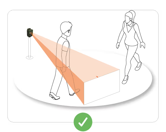
Faced with all these biases and errors, a single approach guarantees reliable data: continuous automatic measurement over a sufficiently long period to capture temporal variations.
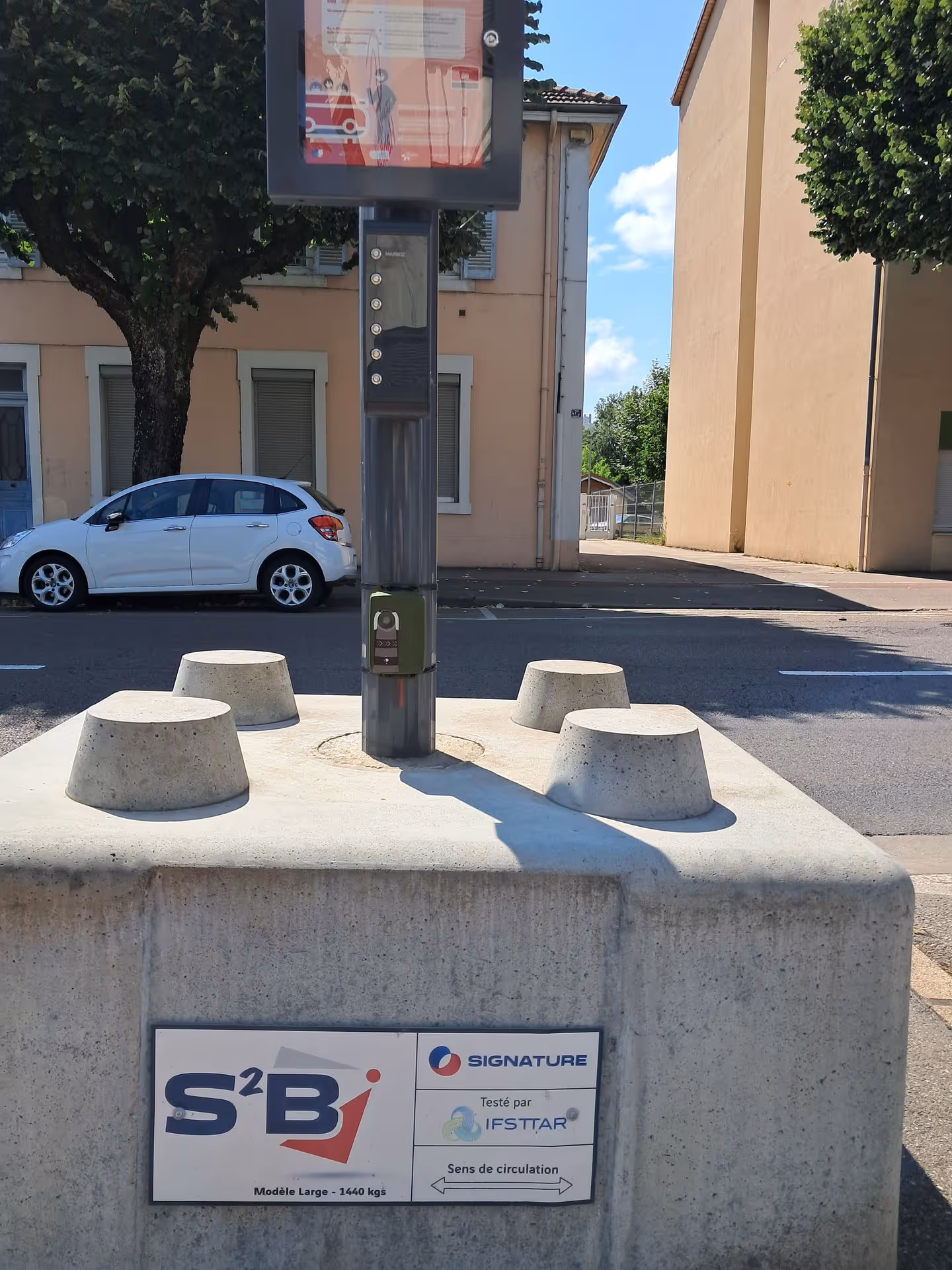
Automatic sensors (thermal, radar, loops) eliminate human biases: no fatigue, no inter-observer variation, no effect of the observer's presence. The method is stable over time, which ensures the comparability of the data.
24/7 measurement captures all variations: weekdays vs weekends, mornings vs evenings, summer vs winter, good weather vs bad weather, school periods vs vacations. It avoids sampling biases that affect one-time observations.
A week of measurement can capture daily variations but is still insufficient for seasonal variations. Three months of measurement start to give a stable picture. Six to twelve months make it possible to capture all annual variations and to produce reliable estimates of annual attendance.
Order of magnitude: For a site with a high seasonality (tourist greenway, beach), a minimum of 6 months of measurement including high and low season is required. For a site with more stable use (urban cycle route), 3 months may be enough to obtain a correct estimate.
Communities that install sensors regularly discover significant differences between their initial perception and measured reality:
Case 1: A trail considered “not very busy” registers 12,000 passages annually (35/day on average), but concentrated on weekends and holidays. The agents, who visit during the week, do not see anyone and conclude that there is underuse. The data shows intense but time-concentrated use.
Case 2: A bike path considered “saturated” by local residents registers 250 cyclists/day, i.e. one pass every 3 minutes on average over 12 hours of the day. Local residents observed the peaks of 8 a.m. to 9 a.m. and 6 p.m. and 6 p.m. to 7 p.m. (80 cyclists/hour, i.e. one pass every 45 seconds) and generalized.
Case 3: A public square considered “always crowded” by retailers has 2,000 passengers per day, 70% of which are between 12 p.m. and 2 p.m. The perception of permanent saturation comes from observation during business hours (which coincide with peak attendance).
Mistakes in the perception of attendance are not individual faults. These are universal cognitive biases that affect everyone, including space managers, elected officials, and experts. Recognizing these biases is not a criticism — it is a scientific observation.
The operational consequence is clear: You cannot manage public spaces based on perceptions, no matter how sincere they may be. Investment, sizing and regulatory decisions must be based on objective data, produced by robust methods, over sufficiently long periods of time.
This does not mean that feelings, qualitative observations and feedback are not valuable. On the contrary: they provide information that numbers alone cannot provide (quality of experience, conflicts of use, motivations). But they can't be used as a basis for quantifying.
Territories that accept this reality — and invest in continuous measurement systems — quickly notice that objective data surprises them, challenges certain certainties and opens up courses of action that they had not considered. It is precisely because measurement sometimes contradicts our intuitions that it is useful.
To pilot without measuring is to pilot with your eyes closed. We can get lucky. But you can also be wrong — and never know it.


.svg)


.avif)