The first mistake in building an indicator system is to confuse the resources deployed and the results obtained.
Mean indicators describe public action: kilometers of bike paths created, number of bicycle arches installed, budget devoted to active mobility, number of bicycle driving training sessions organized.
These indicators are necessary to report on service activity, justify the use of budgets and communicate on achievements. They help answer the question: “What did we do? ”
But they don't say anything about the impact. Creating 10 kilometers of bike paths does not guarantee that they will be used. Installing 200 bike racks does not mean they will fill up. Training 500 people to bike does not prove that they will actually start pedaling for their daily trips.
The performance indicators measure the effect produced by public action: number of cyclists on new developments, evolution of the modal share of cycling in travel, reduction of CO₂ emissions linked to transport, improvement of air quality.
These indicators are more difficult to produce. because they require measurement devices (sensors, surveys, mobility data) that are not always in place. They also involve distinguishing what results from public action from what results from other factors (weather, economic context, societal trends).
But they are the ones who make it possible to fly. Knowing that a newly created bike path is used by 300 cyclists per day (result) rather than knowing that it measures 2 kilometers (average) makes it possible to assess the relevance of the investment and to adjust future choices.
A robust indicator system combines the two approaches :
The trap is to stop at indicators of resources, which are reassuring (“we acted”) but which prove nothing about the effectiveness of the action.
To effectively manage a mobility policy, it is useful to structure the indicators into five complementary families. Each one answers a different strategic question.
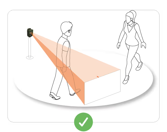
Volume indicators measure the actual use of active mobility infrastructures: number of cyclists on a cycle path, number of pedestrians on a path, number of users on a greenway.
Why it's important: These figures make it possible to verify that the infrastructures created meet a real need, to size future developments and to produce objective data for financing applications.
Examples of indicators:
How to produce them: Automatic sensors installed on strategic axes, occasional manual counts for validation, mobility surveys for home-work trips.
Limit to know: Volume alone says nothing about the quality of the experience, user satisfaction or environmental impact. It is a necessary but insufficient basis.
Modal distribution (or “modal share”) measures the proportion of trips made with each mode of transport: walking, cycling, public transport, car.
Why it's important: The objective of active mobility policies is not only to increase the number of cyclists in absolute terms, but to change the balance between modes in favor of soft mobility. A 10% increase in the number of cyclists accompanied by a 20% increase in car traffic is not a success.
Examples of indicators:
How to produce them: Mobility surveys (EMD, EMC²), counting data crossed with car traffic data, regular surveys with representative samples.
Limit to know: Mobility surveys are cumbersome and expensive. They are generally carried out every 5-10 years, which does not allow for fine monitoring. It is necessary to supplement with proxies (evolution of bicycle use measured continuously).
Evolution indicators measure trends: progression or regression in attendance, acceleration or slowdown in uses, seasonality.
Why it's important: An active mobility policy is judged by its capacity to sustainably transform practices. A one-off increase in attendance (event, nice weather) means nothing. What matters is the underlying trend.
Examples of indicators:
How to produce them: Continuous counting data over several years, with particular attention to the comparability of periods (compare July N with July N-1, not July N with January N).
Limit to know: A drop in attendance is not always a failure. It can reflect a movement of flows to new axes (network effect). The interpretation should be contextual.
Seasonality measures the variations in attendance at different times of the year, days of the week and time slots.
Why it's important: Understanding seasonality makes it possible to adapt services (reinforced maintenance in high season, targeted communication during off-peak periods), to detect utility uses (peaks at peak times) and recreational uses (peaks at weekends), and to anticipate needs.
Examples of indicators:
How to produce them: Analysis of automatic counting data with hourly granularity, crossing with weather variables and school calendar.
Limit to know: Seasonality is not a problem in itself. This is a characteristic that must be understood in order to adapt management. A very seasonal use (tourist greenway) requires a different strategy than a stable use all year round (urban pendulum).
Impact indicators measure the changes produced by mobility policies: modal shift, reduction of emissions, improvement of road safety, improvement of public health.
Why it's important: That is the aim of public action. Creating bike paths is not an objective in itself, it is a way to reduce pollution, improve health, decarbonize transport.
Examples of indicators:
How to produce them: Crossing several data sources (counts, surveys, traffic data, health data), modeling, before-and-after studies.
Limit to know: Causal attribution is always difficult. A reduction in accidents can result from bicycle improvements, but also from better general road prevention. It is necessary to be careful in the conclusions and to explain the hypotheses.
Having lots of indicators is one thing. Organizing them in a way that is legible for decision-makers is another. An effective dashboard respects several principles.
Not all indicators have the same strategic importance. A distinction must be made between:
Strategic indicators (3 to 5 maximum) : These are the key figures that elected officials and directorates-general follow. Examples: modal share of cycling, annual evolution of cycling use, number of km of secure cycling facilities.
Operational management indicators (10 to 15) : These are the metrics that technical services use to adjust their actions on a daily basis. Examples: attendance by axis, hourly distribution, occupancy rate of bicycle parking.
Context indicators (unlimited) : Background data helps to interpret strategic indicators. Examples: weather, local events, work on the road network.
A readable dashboard highlights the strategic indicators (page 1), details the management indicators (following pages) and leaves the context indicators in the annex.
Raw numbers are hard to interpret. Visualizations (graphs, curves, maps) make information immediately intelligible.
Examples of effective visualizations:
Golden rule: A decision maker should be able to understand the essentials in 30 seconds of reading the graph, without having to read a textual explanation.
An isolated number means nothing. Is “500 cyclists per day” a lot or a little? The answer depends on the context.
Three ways to contextualize:
Each indicator should be accompanied by at least one of these three context elements.
A dashboard that is updated every week creates noise more than information. A dashboard that is updated once a year is too late to allow for adjustments.
Recommended pace according to the type of indicator:
This pace makes it possible to detect trends without drowning in short-term variations.
Even well-intentioned, local authorities often make the same mistakes in building their mobility indicator systems.
The kilometers of bike paths created are easy to measure (maps, GIS). Effective use of these trails is more difficult (requires sensors). As a result, many communities stop for miles and never measure usage.
Consequence: We pilot on the means (“we created X km”) without knowing if these means produce the expected results (“Y cyclists use them”).
Good practice: Investing in attendance measurement devices, even modest ones (a few sensors on strategic axes), to complement resource indicators with result indicators.
Some mobility dashboards include 50 indicators regardless of priority. The result: decision-makers are drowned in information and no longer know what to look for.
Consequence: The dashboard becomes a formal exercise (“we produce numbers”) with no effect on decision-making.
Good practice: Limit strategic indicators to 3-5, organize the others by level of detail, and build a summary page that fits on one screen.
Comparing the use of an urban bike path with that of a rural greenway makes no sense. The contexts, the user profiles, the functions are incomparable.
Consequence: Erroneous conclusions (“our greenway is underused compared to the urban track”) when the two infrastructures perform different functions.
Good practice: Compare only infrastructures of the same nature, in similar contexts. Or clearly explain differences in context to avoid simplistic interpretations.
A purely quantitative system of indicators (number of cyclists, kilometers travelled, CO₂ reduction) misses an essential part of reality: user satisfaction, barriers to use, conflicts of use.
Consequence: A policy can show good numbers while generating dissatisfaction (busy bike paths but perceived as dangerous, saturated greenways at peak times).
Good practice: Complete quantitative indicators with regular satisfaction surveys (every 2 years), perception barometers, and qualitative interviews with typical users.
An effective mobility indicator system is never purely numerical. It combines:
Objective quantitative data (measured attendance, distances travelled, changes over time) that make it possible to monitor trends, compare situations and produce factual reports.
Qualitative feedback from users (satisfaction, obstacles, suggestions, points of tension) that make it possible to understand behaviors, identify problems that are not visible in the figures and to anticipate changes.
A contextual analysis which intersects the two sources and avoids mechanical interpretations. A drop in attendance can be a problem (infrastructure that no longer meets needs) or a normal evolution (transfer to a new, more efficient route). Only contextual analysis can make a decision.
Example of integrated control:
A community is observing a stagnation in cycling traffic despite significant investments.
The action to be taken is changing radically: rather than creating new sections, it is first necessary to secure the existing cut-off points.
Indicators are not an end in themselves. They are only valid if they allow better decisions to be made: where to invest first, which arrangements produce the best results, what uses are emerging and must be supported, what points of friction must be corrected.
A good mobility indicator system meets three requirements:
The communities that build these robust indicator systems are finding that they are transforming the way they manage their mobility policies. They go beyond visual control to enter data management — which does not guarantee never to make mistakes, but significantly increases the probability of making good decisions.


.svg)